Visual design
Visual design
Visual design
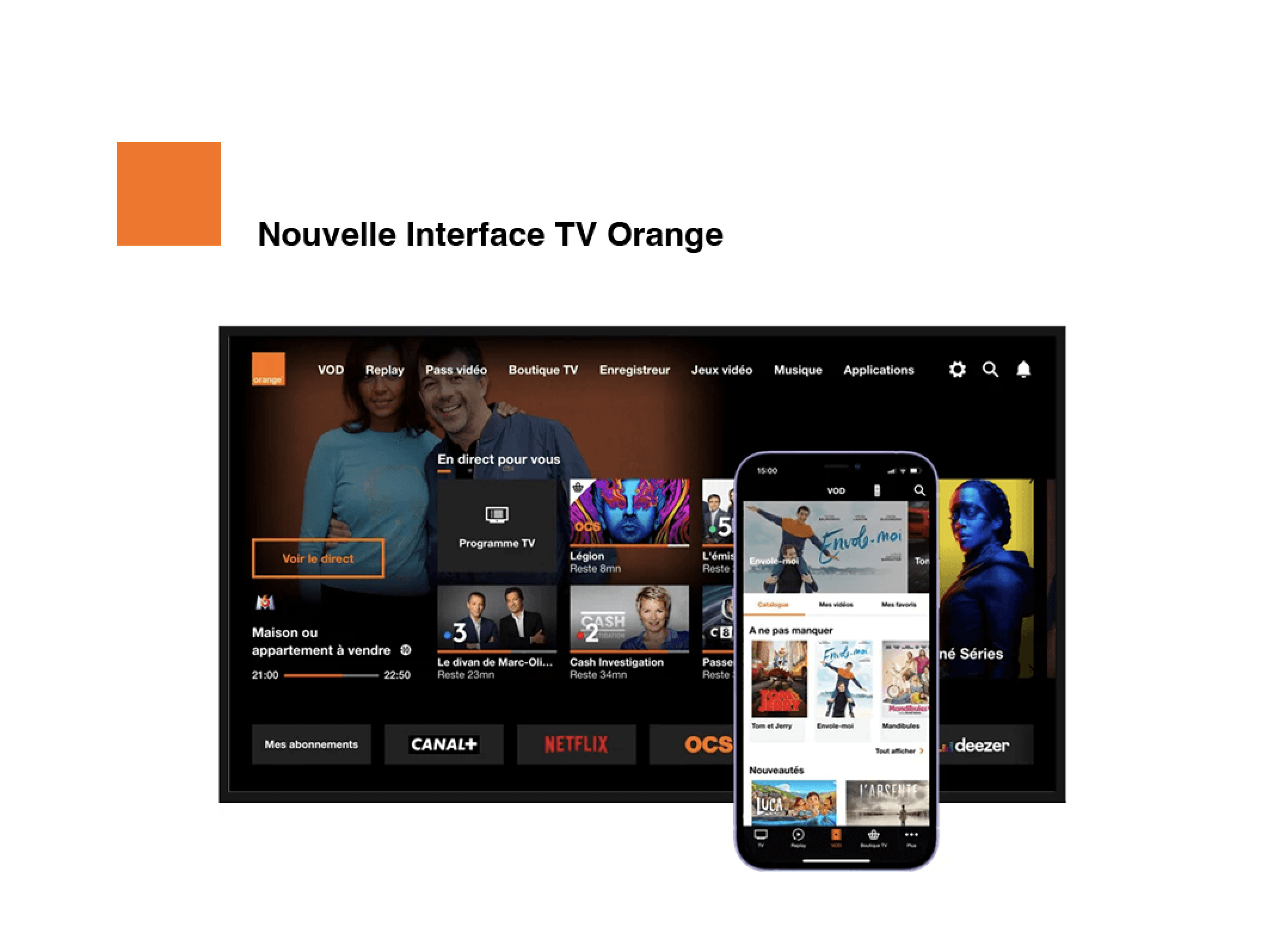
This project involved a complete renewal of the Orange Entertainment catalog compliment their new TV and application platform.
This project involved a complete renewal of the Orange Entertainment catalog compliment their new TV and application platform.
This project involved a complete renewal of the Orange Entertainment catalog compliment their new TV and application platform.
Client:
Orange
My Role:
Digital Designer
Year:
2018 - 2020
Service Provided:
Art Direction, UI Design
At Orange, I worked production for their Entertainment business unit, the visuals for the TV and web interface. In the discovery phase, we found inconsistencies in the grids and alignments, inconsistencies in the typography. We found that the work was shared and the team-members were changing often. We discovered that there were inconsistencies in the templates. The production load was important.
At Orange, I worked production for their Entertainment business unit, the visuals for the TV and web interface. In the discovery phase, we found inconsistencies in the grids and alignments, inconsistencies in the typography. We found that the work was shared and the team-members were changing often. We discovered that there were inconsistencies in the templates. The production load was important.


Here above left, we have a before version of the formula which used a format of 7 different sizes and various tags in different colors and titles, including special offers and hours. It was rather complex and while it worked, it gave a very busy impression when looking at the ensemble. Above right, is an example of the sports programming, we tried to get rid of the blocks of color, to minimise the decoration and establish what would be thematic templates. Hierarchic reading of information with a focus on accessibility. Here below, you can see that we took great time and attention to troubleshoot the "zones of risk" for the different screen sizes. We give great importance to the content, to identify the the essential information will display clearly and beautifully. Not everything can have the same priority, so we identified the safe zones, to know that the important content will be visible and accessible. We made new templates that would be shared in our work libraries. We defined clear standards for our typography & color charts, also to ensure accessibility, for quality display. We worked hand in hand with the UX team and UI team and development, to identify the image sizes and acceptable standards.
Here above left, we have a before version of the formula which used a format of 7 different sizes and various tags in different colors and titles, including special offers and hours. It was rather complex and while it worked, it gave a very busy impression when looking at the ensemble. Above right, is an example of the sports programming, we tried to get rid of the blocks of color, to minimise the decoration and establish what would be thematic templates. Hierarchic reading of information with a focus on accessibility. Here below, you can see that we took great time and attention to troubleshoot the "zones of risk" for the different screen sizes. We give great importance to the content, to identify the the essential information will display clearly and beautifully. Not everything can have the same priority, so we identified the safe zones, to know that the important content will be visible and accessible. We made new templates that would be shared in our work libraries. We defined clear standards for our typography & color charts, also to ensure accessibility, for quality display. We worked hand in hand with the UX team and UI team and development, to identify the image sizes and acceptable standards.


We put an emphasis on image, simplicity and readability. During the launch of the new platform, there was a 27% increase in new subscriptions. Encouraged by such positive indicators, we continued to improve and try new things, such as A / B testing.
We put an emphasis on image, simplicity and readability. During the launch of the new platform, there was a 27% increase in new subscriptions. Encouraged by such positive indicators, we continued to improve and try new things, such as A / B testing.

The extremely diverse screensizes and the sometimes heavy amount of information to be shown, we had to bring back the "block" which helped in the accessibility of the information. A design system was created, for consistency. We had to indentify what parts of the image were at risk to be unseen due to the adaptive screen sizes.
The extremely diverse screensizes and the sometimes heavy amount of information to be shown, we had to bring back the "block" which helped in the accessibility of the information. A design system was created, for consistency. We had to indentify what parts of the image were at risk to be unseen due to the adaptive screen sizes.


I learned about the importance of accessibility. As we were a team of designers, using templates that were not always the same. By imposing stricter standards, this made our designs hold together as the team scaled up or down, the quality remained the same. The product that was being sold, was the service of entertainment and sometimes banking. The content must have identity and consistency, it must be a pleasure to engage with and we should be able to discover what we are looking for. Orange has other activities, such as Orange Bank and Technological Innovations so they integrated the same graphic systems. During this time, covid hit the workplace, home working put our work systems to the test and they survived. We continue to fine-tune the design standards and test the solutions on new content.
I learned about the importance of accessibility. As we were a team of designers, using templates that were not always the same. By imposing stricter standards, this made our designs hold together as the team scaled up or down, the quality remained the same. The product that was being sold, was the service of entertainment and sometimes banking. The content must have identity and consistency, it must be a pleasure to engage with and we should be able to discover what we are looking for. Orange has other activities, such as Orange Bank and Technological Innovations so they integrated the same graphic systems. During this time, covid hit the workplace, home working put our work systems to the test and they survived. We continue to fine-tune the design standards and test the solutions on new content.