Bandsintown
Bandsintown
Bandsintown
Making a site redesign to connects music lovers to local concerts
Making a site redesign to connects music lovers to local concerts
Making a site redesign to connects music lovers to local concerts
Client:
Bandsintown - personal project
My Role:
UI Designer
Year:
2023
Service Provided:
Product Design, UI Design
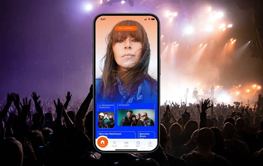
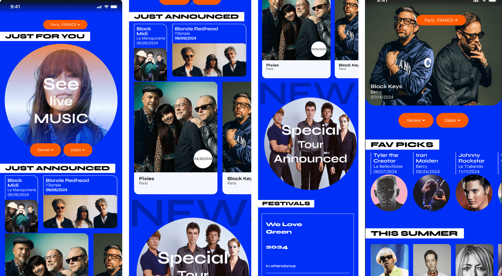
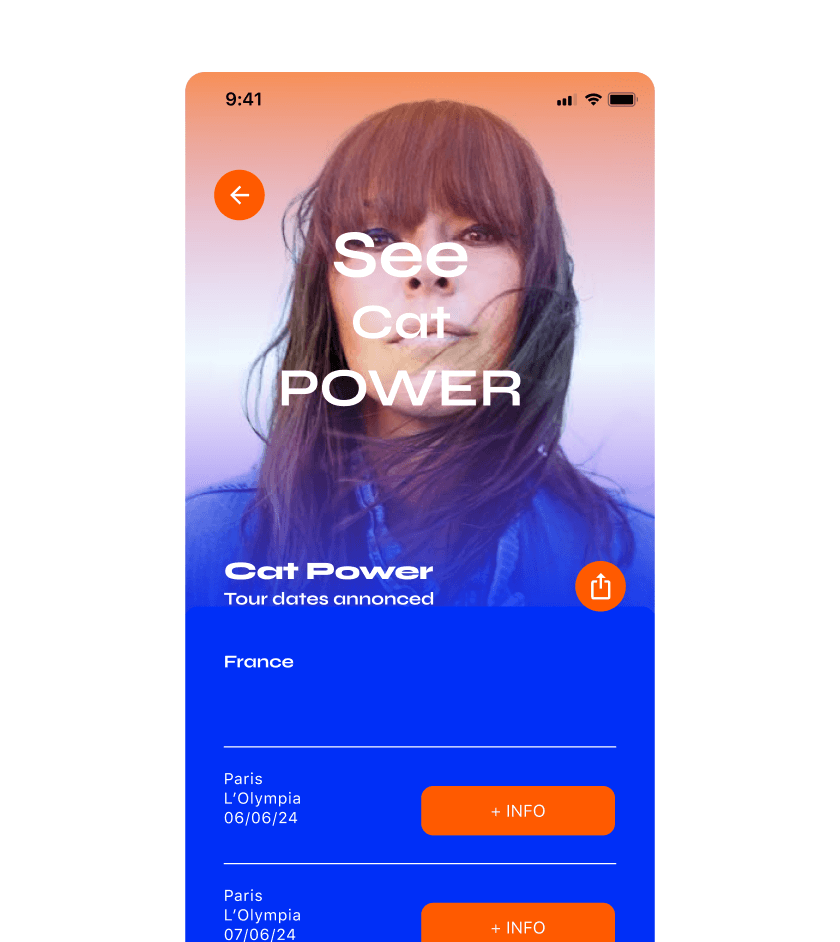
Bandsintown is a concert discovery app that integrates data from users' music streaming accounts to create personalized lists of tracked artists for local concert recommendations. It gathers tour dates from over 200 ticket providers, booking agencies, and directly from artists. The idea was to generate new customers, more engagement and returning customers, gaining the trust and confidence of this app. This is an interface redesign, I didn't restructure the information. I changed the grid for a little more space to clarify the grouped information using proximity and distance for visual cues that help identify what information belongs together. The subject is about music, I chose a vibrant approach for the graphic solution, a variety of new card designs. The interface design should facilitate an easy experience for search, personalisation and purchasing of tickets. Taking inspiration from music fanzines and concert posters.
Bandsintown is a concert discovery app that integrates data from users' music streaming accounts to create personalized lists of tracked artists for local concert recommendations. It gathers tour dates from over 200 ticket providers, booking agencies, and directly from artists. The idea was to generate new customers, more engagement and returning customers, gaining the trust and confidence of this app. This is an interface redesign, I didn't restructure the information. I changed the grid for a little more space to clarify the grouped information using proximity and distance for visual cues that help identify what information belongs together. The subject is about music, I chose a vibrant approach for the graphic solution, a variety of new card designs. The interface design should facilitate an easy experience for search, personalisation and purchasing of tickets. Taking inspiration from music fanzines and concert posters.
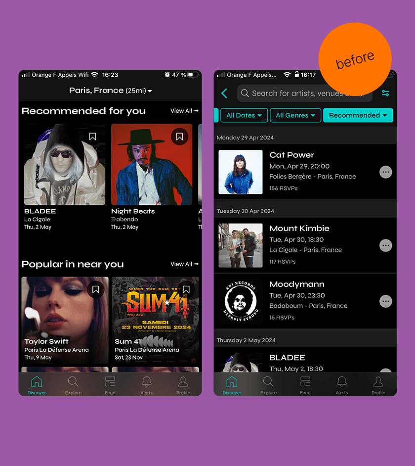
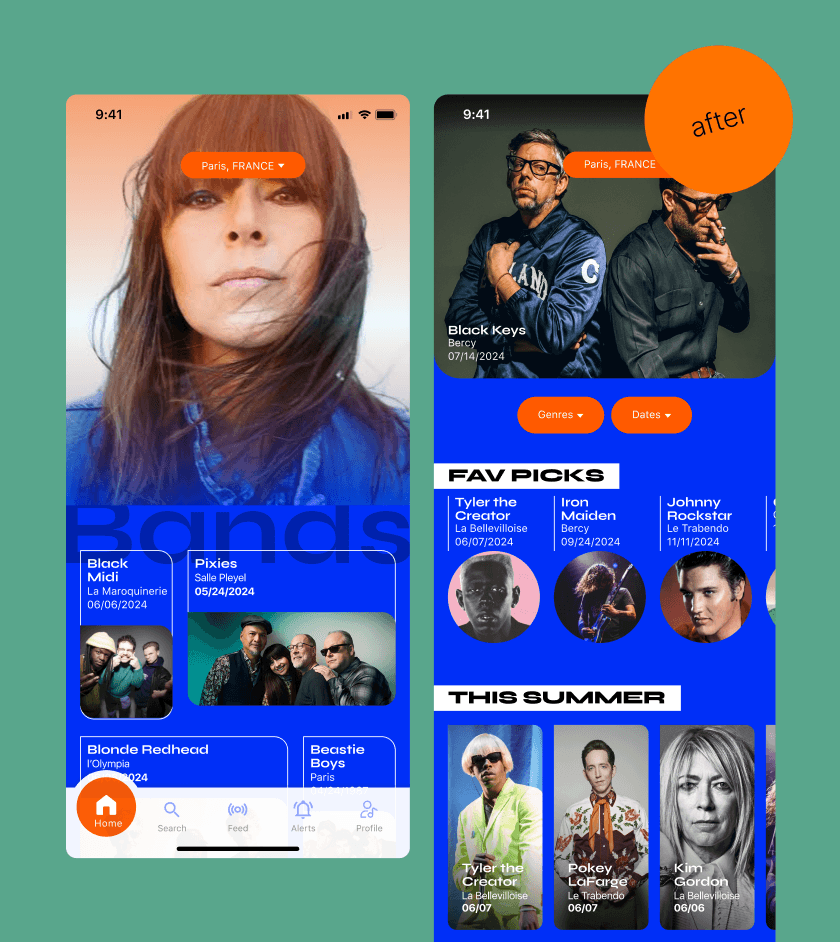
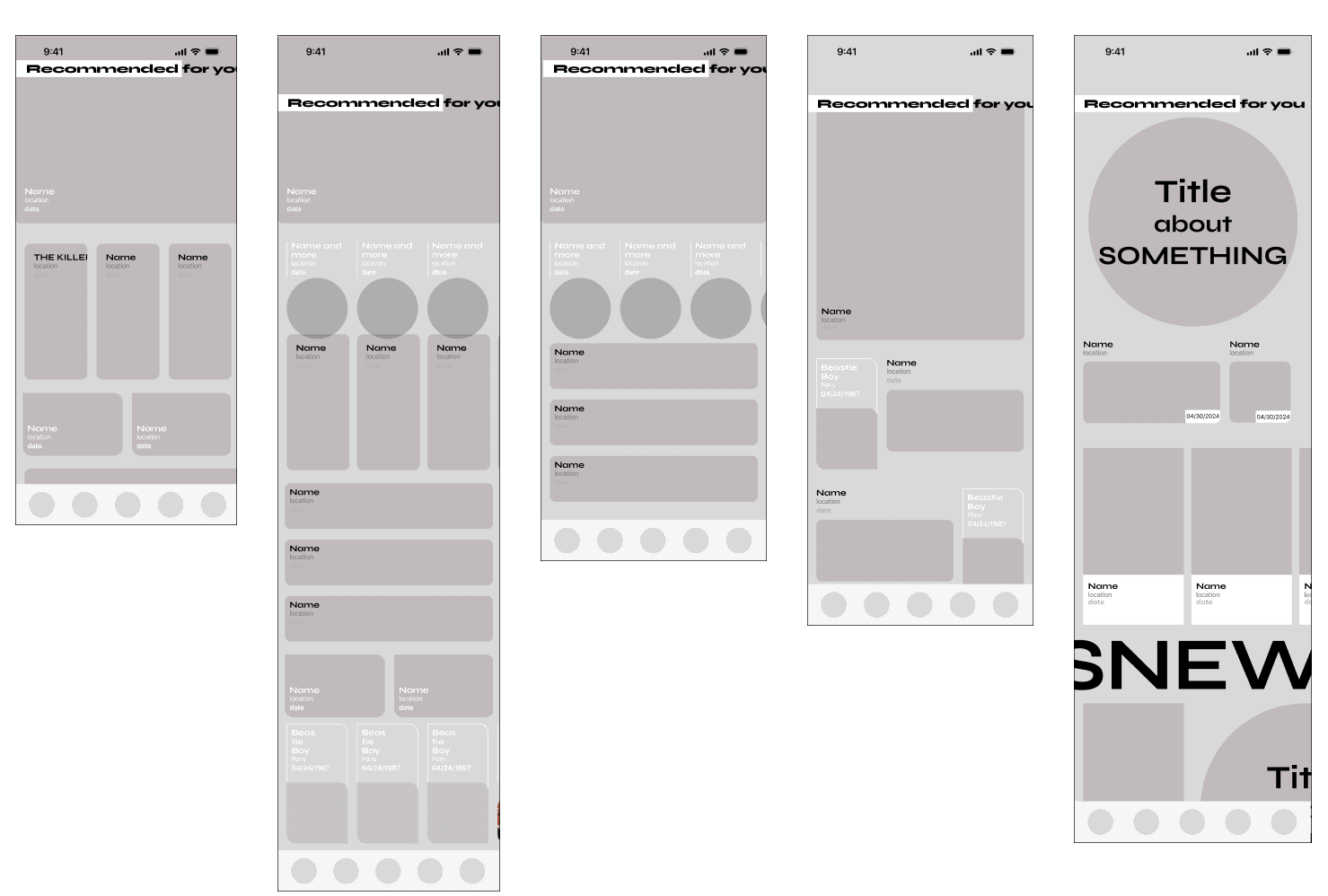
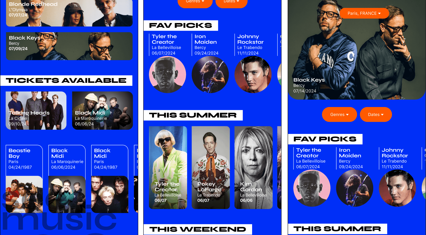
Here above is the before and after, the landing page and the recommendations pages. There was confusion with the grouping of information, the hierarchy was unclear. My solution above and right. Below is the mid-fidelity solution, I started to commit to some typography styles yet I am concentration in creating variety of card styles that create intrigue and engage the user to discover the offer.
Here above is the before and after, the landing page and the recommendations pages. There was confusion with the grouping of information, the hierarchy was unclear. My solution above and right. Below is the mid-fidelity solution, I started to commit to some typography styles yet I am concentration in creating variety of card styles that create intrigue and engage the user to discover the offer.
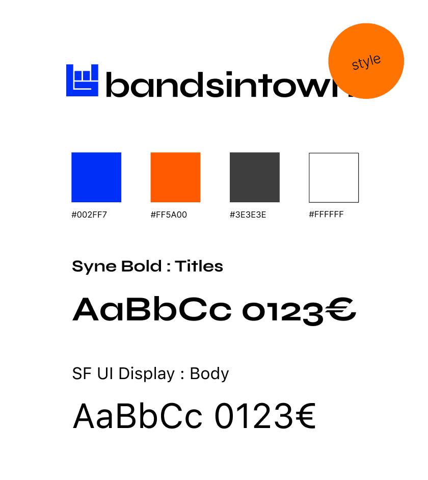
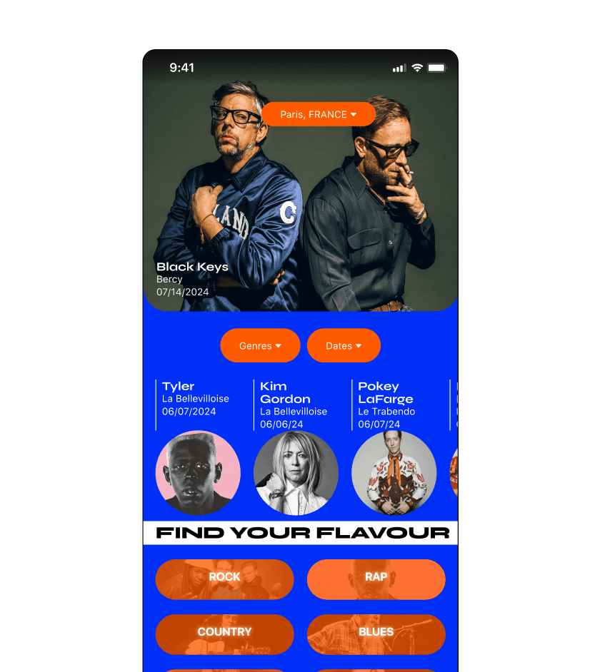
We chose an electric blue for the primary color, the same blue as the hand in the logo, it's complimentary color, orange as the secondary color. These two colors together vibrate and when the secondary color is used sparingly, for buttons or actionable items, this facilitates a clearer call to action. Syne bold is a typeface that is very large and extended, okay for titles, it is the same as the logo, it does not apologise and has lots of personality, reinforcing the brand.
We chose an electric blue for the primary color, the same blue as the hand in the logo, it's complimentary color, orange as the secondary color. These two colors together vibrate and when the secondary color is used sparingly, for buttons or actionable items, this facilitates a clearer call to action. Syne bold is a typeface that is very large and extended, okay for titles, it is the same as the logo, it does not apologise and has lots of personality, reinforcing the brand.
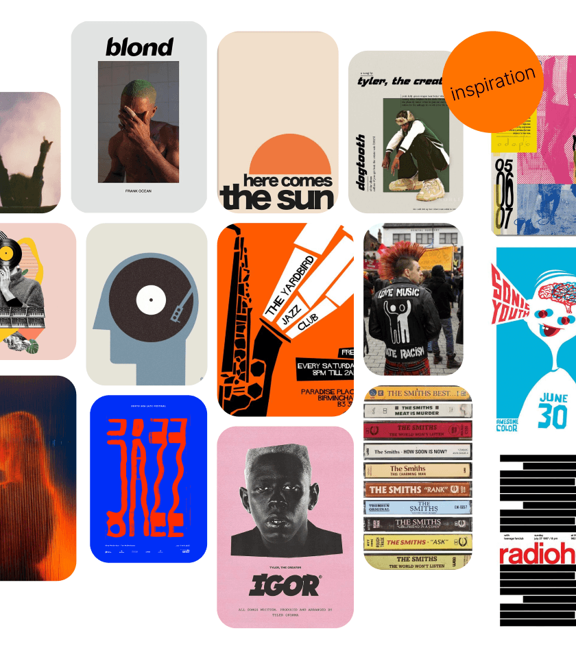
Above you will find the moodboard, lots of feeling, and play, with references to album cover art and posters, there is feedom of expression. Taking inspiration from music, regressive and sometimes rebellious.
Above you will find the moodboard, lots of feeling, and play, with references to album cover art and posters, there is feedom of expression. Taking inspiration from music, regressive and sometimes rebellious.
Lessons learned : Through this app redesign, I learned that unconventional shapes—such as circles—often require more space, but that isn’t necessarily a drawback. In fact, the use of circular elements added a sense of levity to the interface and helped soften what could otherwise feel like a rigid environment. This reinforced the idea that there are effective alternatives to standard squares and rectangles, and that unexpected details can successfully draw user attention. I also received feedback highlighting the strong, saturated color palette as a key strength of the design. With over 80% positive feedback, this validated the color choices and encouraged further exploration, although additional testing would be beneficial to refine and confirm these results. I learned that maintaining a simple color scheme—using a secondary color primarily for actionable or interactive elements—greatly improved user understanding and visual hierarchy. Additionally, spacing played a crucial role in usability. Allowing the information to “breathe” reduced feelings of visual clutter and claustrophobia. The increased spacing between grouped elements made the content easier to scan and understand. Framing elements helped clarify which pieces of information belonged together, reinforcing structure and improving overall comprehension.
Lessons learned : Through this app redesign, I learned that unconventional shapes—such as circles—often require more space, but that isn’t necessarily a drawback. In fact, the use of circular elements added a sense of levity to the interface and helped soften what could otherwise feel like a rigid environment. This reinforced the idea that there are effective alternatives to standard squares and rectangles, and that unexpected details can successfully draw user attention. I also received feedback highlighting the strong, saturated color palette as a key strength of the design. With over 80% positive feedback, this validated the color choices and encouraged further exploration, although additional testing would be beneficial to refine and confirm these results. I learned that maintaining a simple color scheme—using a secondary color primarily for actionable or interactive elements—greatly improved user understanding and visual hierarchy. Additionally, spacing played a crucial role in usability. Allowing the information to “breathe” reduced feelings of visual clutter and claustrophobia. The increased spacing between grouped elements made the content easier to scan and understand. Framing elements helped clarify which pieces of information belonged together, reinforcing structure and improving overall comprehension.